[ ATRIBE / Brand identity ]Boutique branding agency01 — 06 / A shared direction
ATRIBE — Start a tribe.
+ Built to belong.
Don’t just brand. Start a tribe.
A bold identity for people who build brands together.
Direction / Connection / Momentum
[ Identity in motion ]Original logo sequence / Loop
01 / The introduction
One mark. A forward-facing mindset.
[ The idea ]Strategy × Identity × Expression
A shared direction. A distinct identity.
01 —
ATRIBE brings creative people and ambitious brands together. Its identity needed the same balance: precise enough to lead, open enough to connect.
An angular monogram sets the direction. Confident typography gives it a voice. A warm neutral foundation, punctuated by red and sky blue, makes room for both clarity and personality.
[ 02 / A mark with momentum ]Forward, together.
Made to move you.
Sharp geometry. One unmistakable signature.
[ 02 / The logo system ]
One identity. More than one expression.
01 / PrimaryClear. Direct. Recognisable.
02 / StackedA compact signature.
03 / ExpressiveA human touch.
Room to be seen
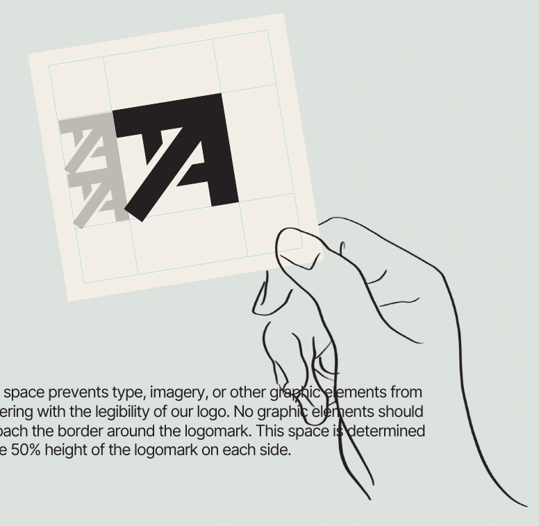
Space is part of the identity.
A consistent clear-space system keeps the mark distinct, whether it sits on a screen, a printed page, or a social tile.
Original construction study / Clear space
Start a tribe. Build a connection.Start a tribe. Build a connection.
[ 03 / The palette ]
Quiet foundation. Confident accents.
A living identity / Select a colour
ATRIBE Red #EF483A
Grey and eggshell do the grounding. Black brings structure. Red adds energy, with sky blue as the unexpected lift.
[ 04 / Type & tone ]Information meets personality
Clarity. With character.
Two voices. One conversation.
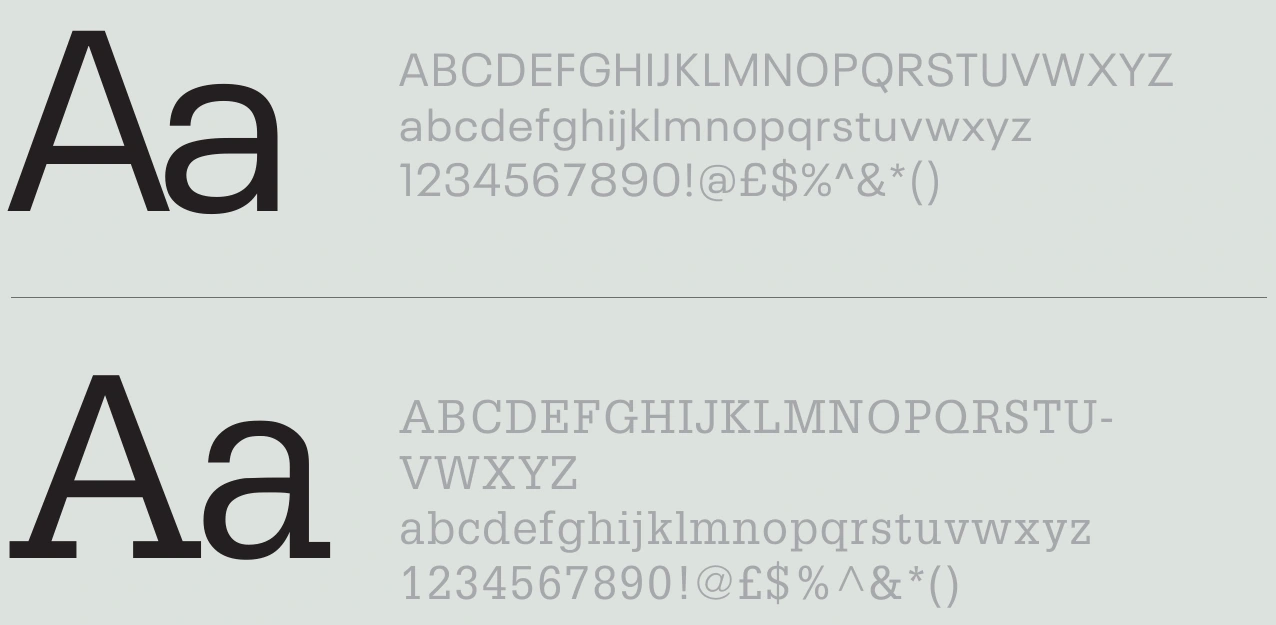
Neue PlakInformation / Regular & bold
GlyphaVoice / Regular & expressive emphasis
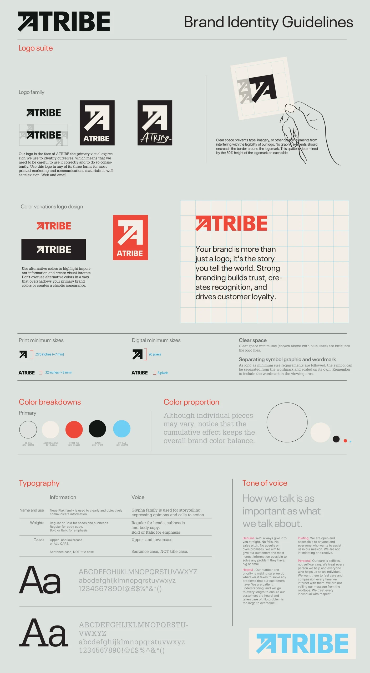
The guide pairs straightforward information with a more expressive storytelling voice. The original type specimens are shown alongside.
Original typography specimens from the final guide
How the brand speaks
Genuine. Helpful. Inviting. Personal.
Human, considered, and always part of the conversation.
[ 05 / Out in the world ]
An identity with something to say.
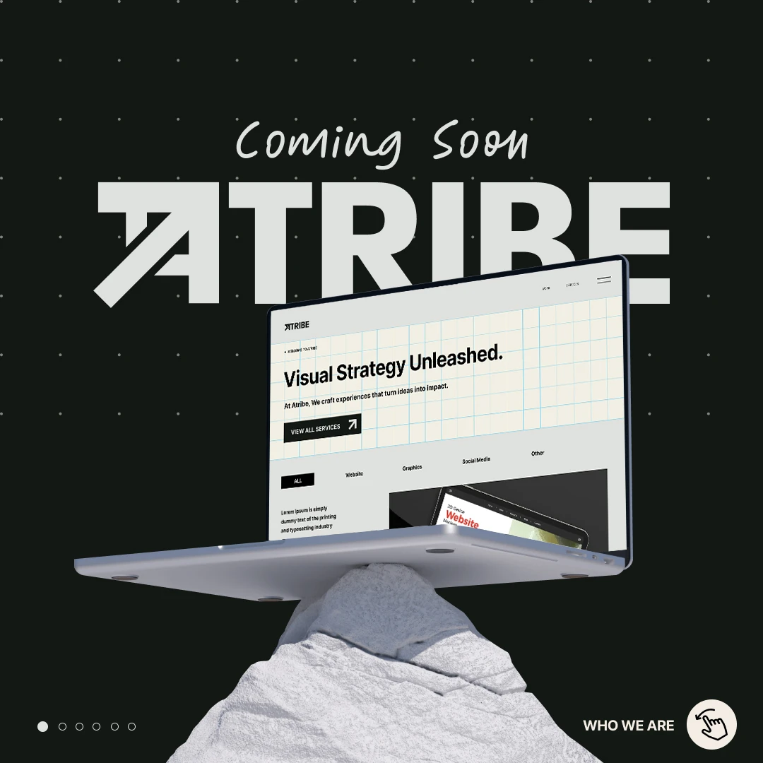
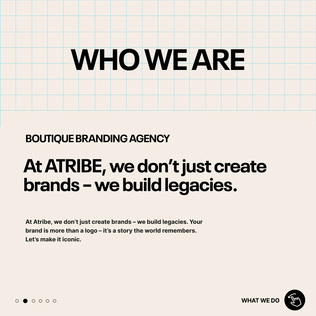
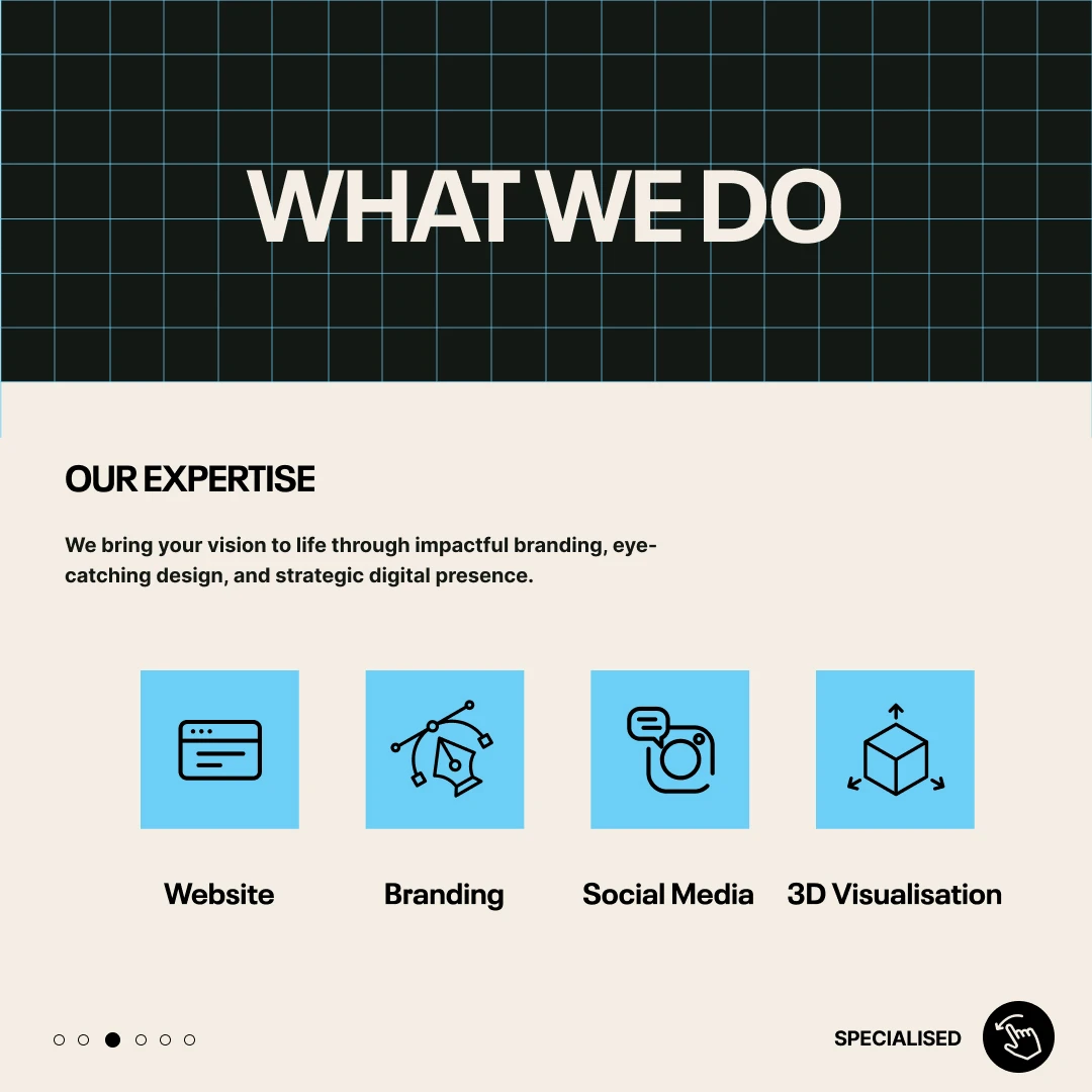
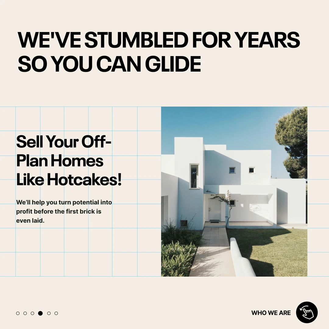
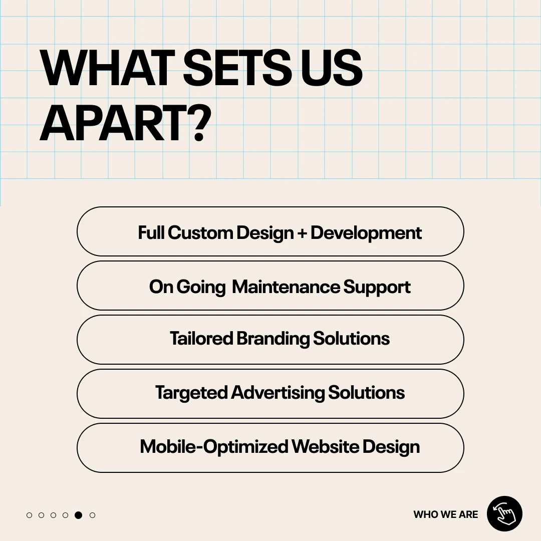
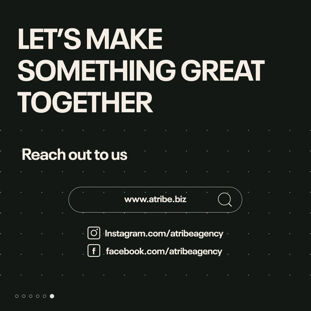
From the first “coming soon” to a full introduction. Six connected pieces bring the agency’s personality, services, and point of view into one recognisable visual language.
01 / The arrival02 / The people03 / The offering04 / The experience05 / The difference06 / The invitation
[ 06 / From the archive ]
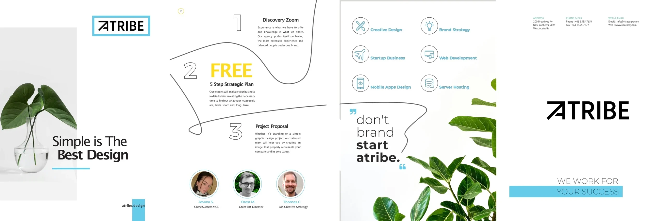
Beyond the screen. Into your hands.
An early brochure study translates the identity into an expansive printed format: bold messages, a clear service story, and the signature sky-blue accent.
Brochure / Early application studyOriginal artwork
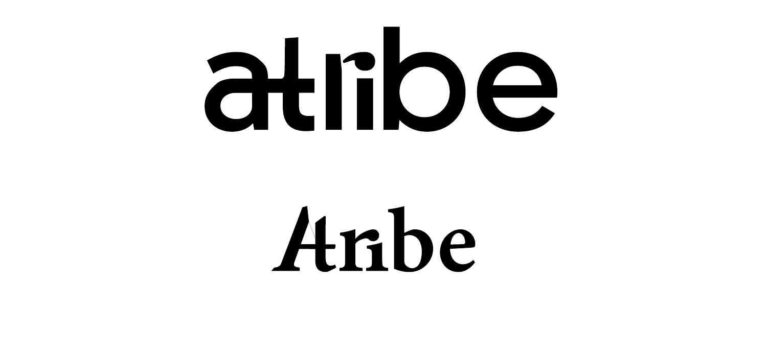
Explore the early wordmark studies +
Early typographic explorations, before the angular identity took its final form.