Kitsune NeboIdentity study / 2024
Kitsune Nebo's original circular fox emblem

Kitsune Nebo

nature’s serenity

Enter the folio A quieter kind
of belonging.

01 / The feelingRooted in nature

A place to
put down
roots.

Homes are more than buildings.
They are a feeling of belonging.

Kitsune Nebo brings that feeling into focus. An organic fox emblem, expressive lettering, and an earthy palette give the identity a character that feels warm, grounded, and quietly distinctive.
Client
Kitsune Nebo
Discipline
Brand identity & visual direction
Applications
Print, signage & social
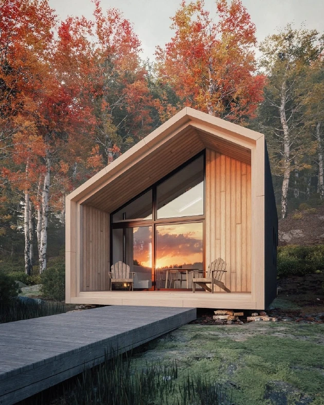
Timber cabin in an autumn landscape, from the original Kitsune Nebo presentation
Natural forms. Human spaces.Fig. 01
02 / The signatureA mark with a life of its own

The instinct
to belong.

Fluid, irregular strokes fold into a fox. The circular form gives the identity a compact signature; the hand-drawn energy keeps it from feeling rigid.
One symbol.
Its own nature.

Detail of the original Kitsune Nebo fox symbol
The original emblemDrawn to be remembered
03 / A material languageColor & type

Earth in
every detail.

Clay and timber. Sand and charcoal. A restrained set of natural tones lets the red signature carry the warmth.

01 / Clay#D95436
02 / Ember#A64029
03 / Sand#D9CAB8
04 / Timber#8C7A64
05 / Charcoal#262626
06 / Paper#F6F1EB
The typographic voice

Character.
And clarity.

An expressive serif meets a softer, rounded sans serif. The contrast carries the identity from a distinctive name to the everyday details.
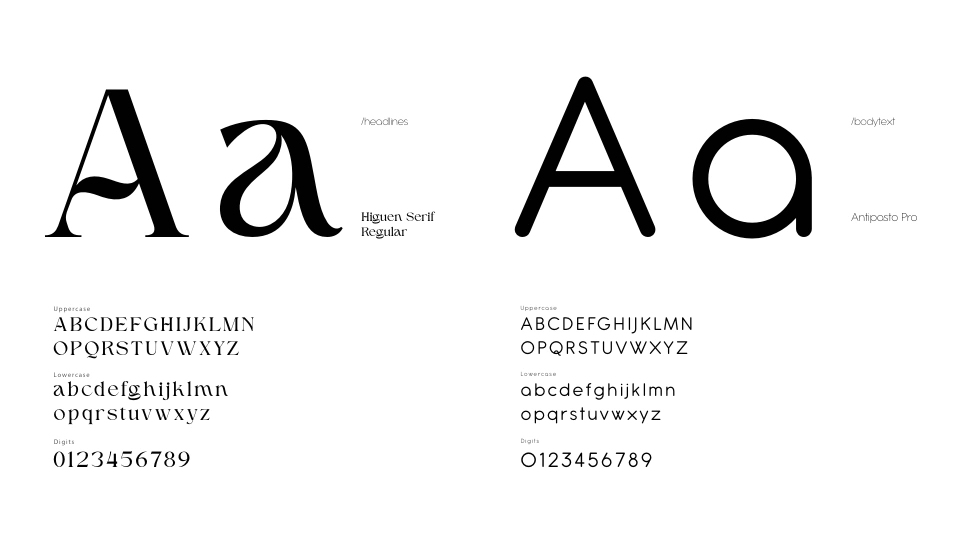
Higuen Serif Regular
Antipasto Pro

Original brand typography specimen: Higuen Serif Regular and Antipasto Pro, with alphabets and numerals
Typography from the final identity guide
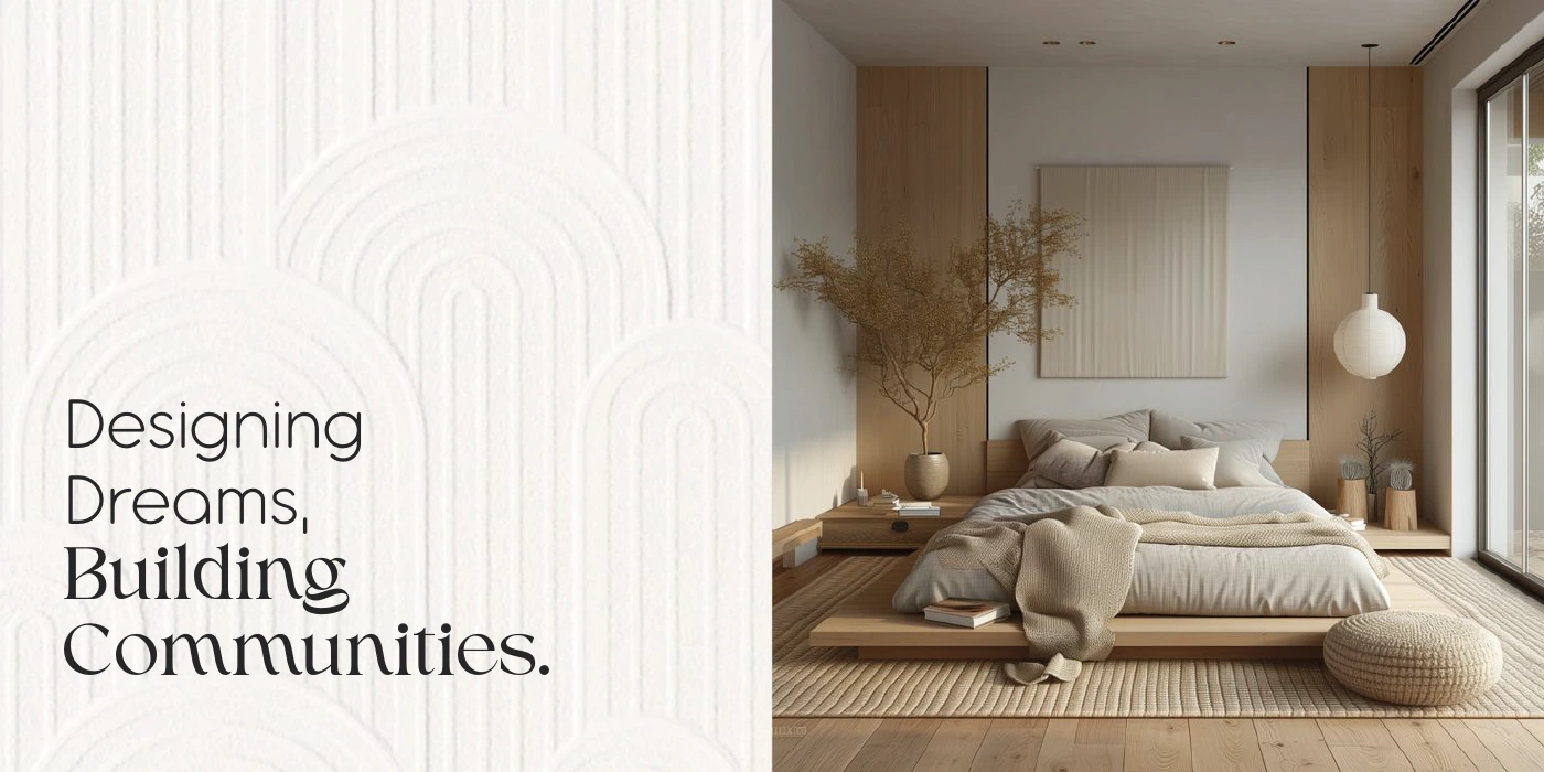
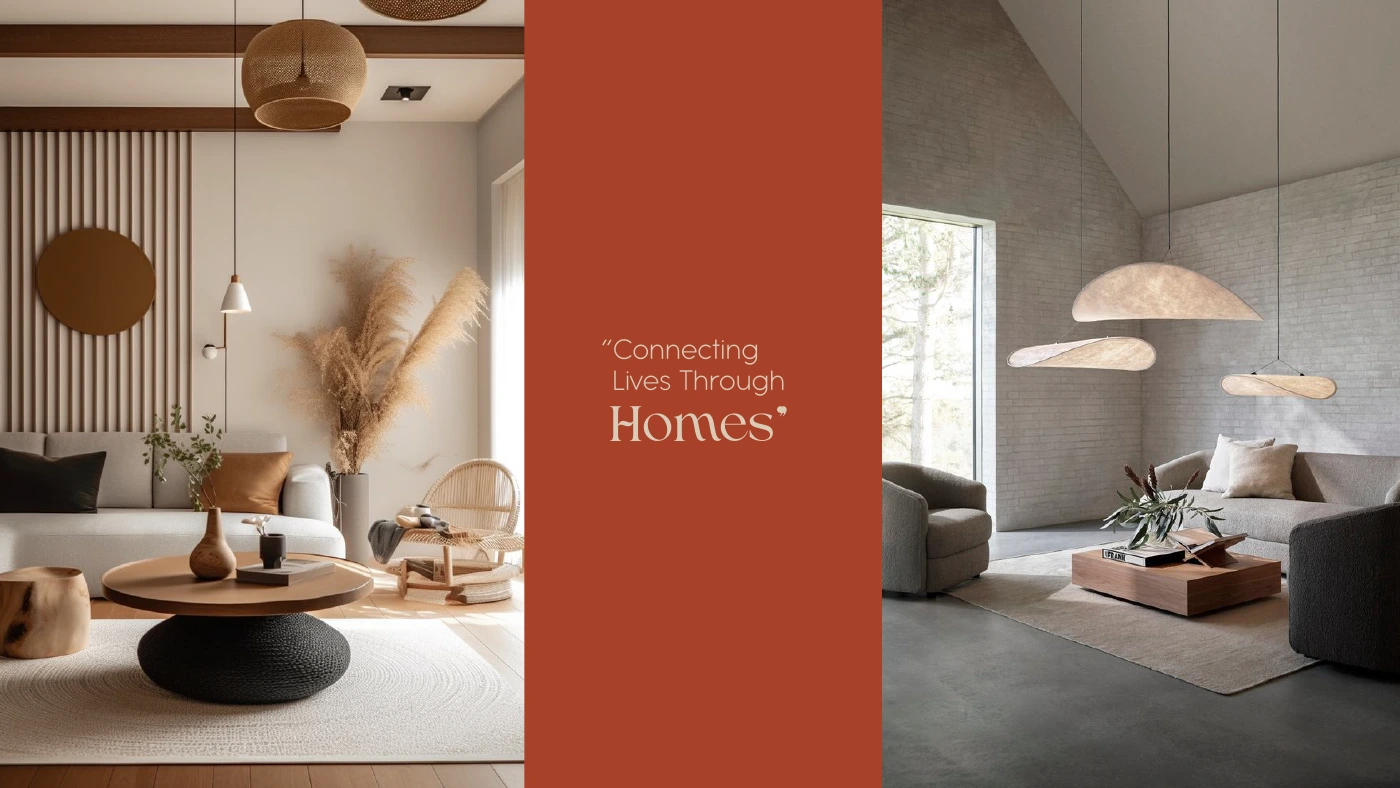
Kitsune Nebo interior moodboard with warm natural materials and the line Connecting Lives Through Homes
04 / Out in the worldThe identity, lived in

Small details.
Lasting impressions.

From the texture of a business card to the rhythm of a social feed, the same warm character runs through every encounter.
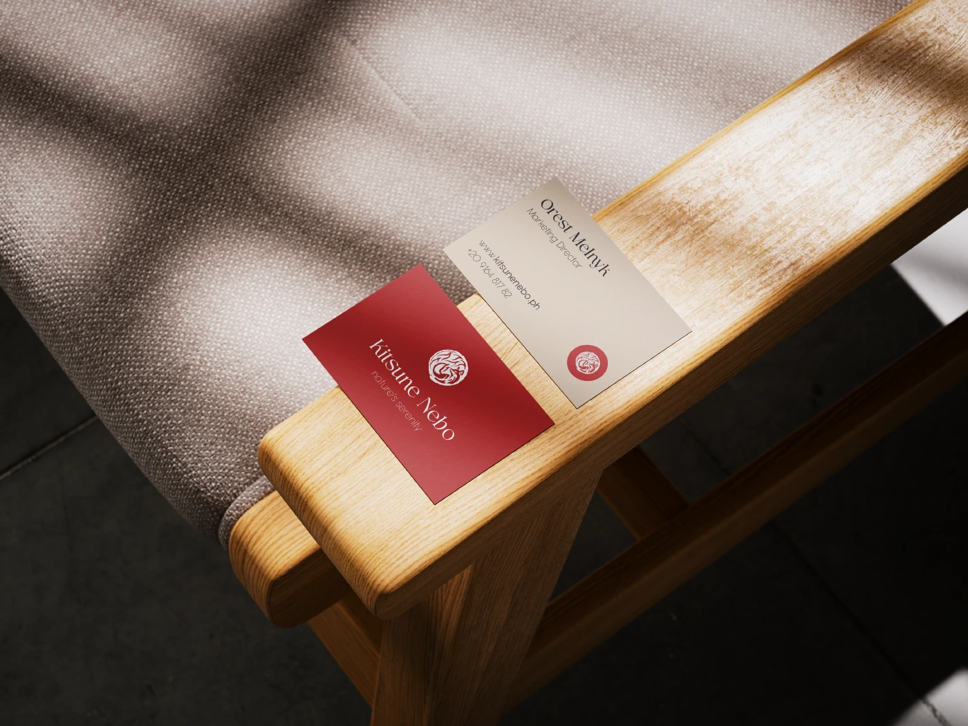
Original Kitsune Nebo business-card mockup on a wooden chair in soft daylight
01 / The first introductionBusiness cards
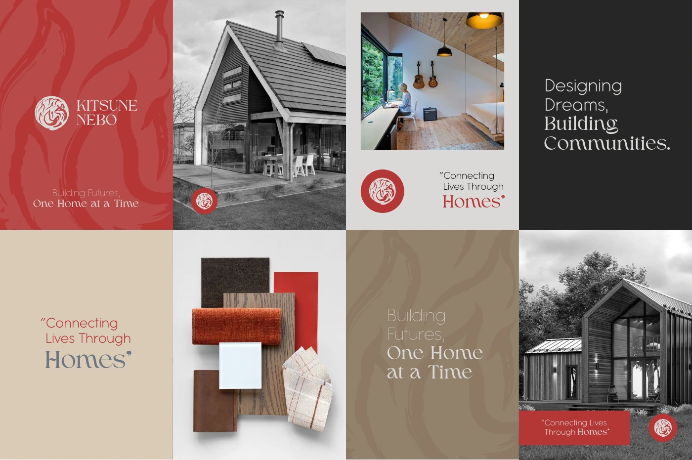
Kitsune Nebo social media designs combining the fox emblem, architectural photography and the earthy brand palette
02 / A recognizable rhythmSocial identity
A consistent feeling

Not perfectly
uniform.
Unmistakably
connected.
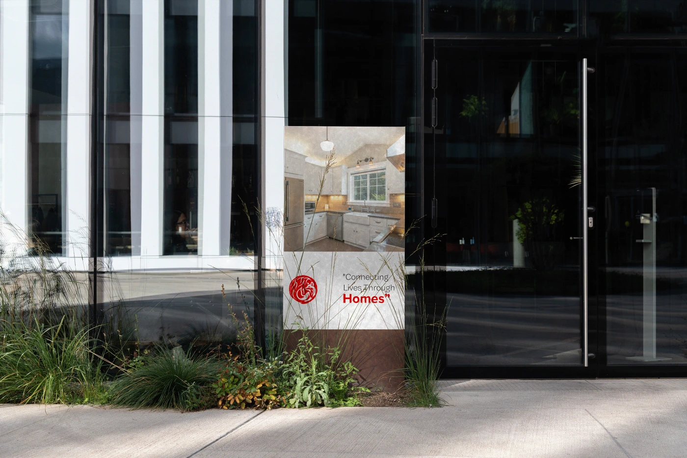
Kitsune Nebo branded standing banner in an architectural setting
03 / A physical presenceSignage
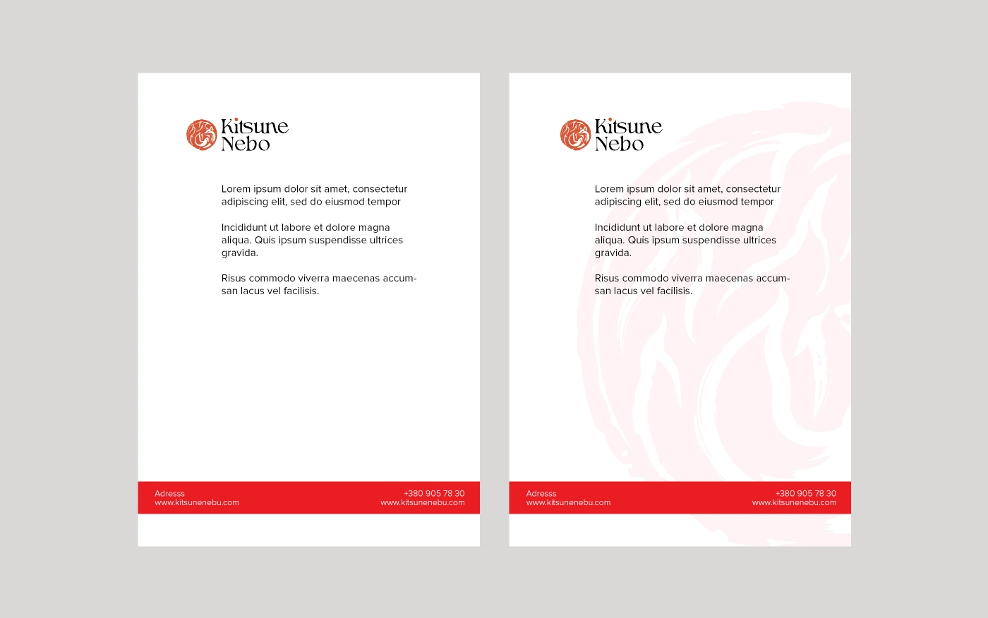
Original Kitsune Nebo letterhead concepts with the fox symbol and red accents
04 / The everyday essentialsStationery
A calm natural-material bedroom from the Kitsune Nebo brand presentation

05 / Nature’s serenity

Less noise.
More nature.


This website stores cookies on your computer. Cookie Policy