Human first.
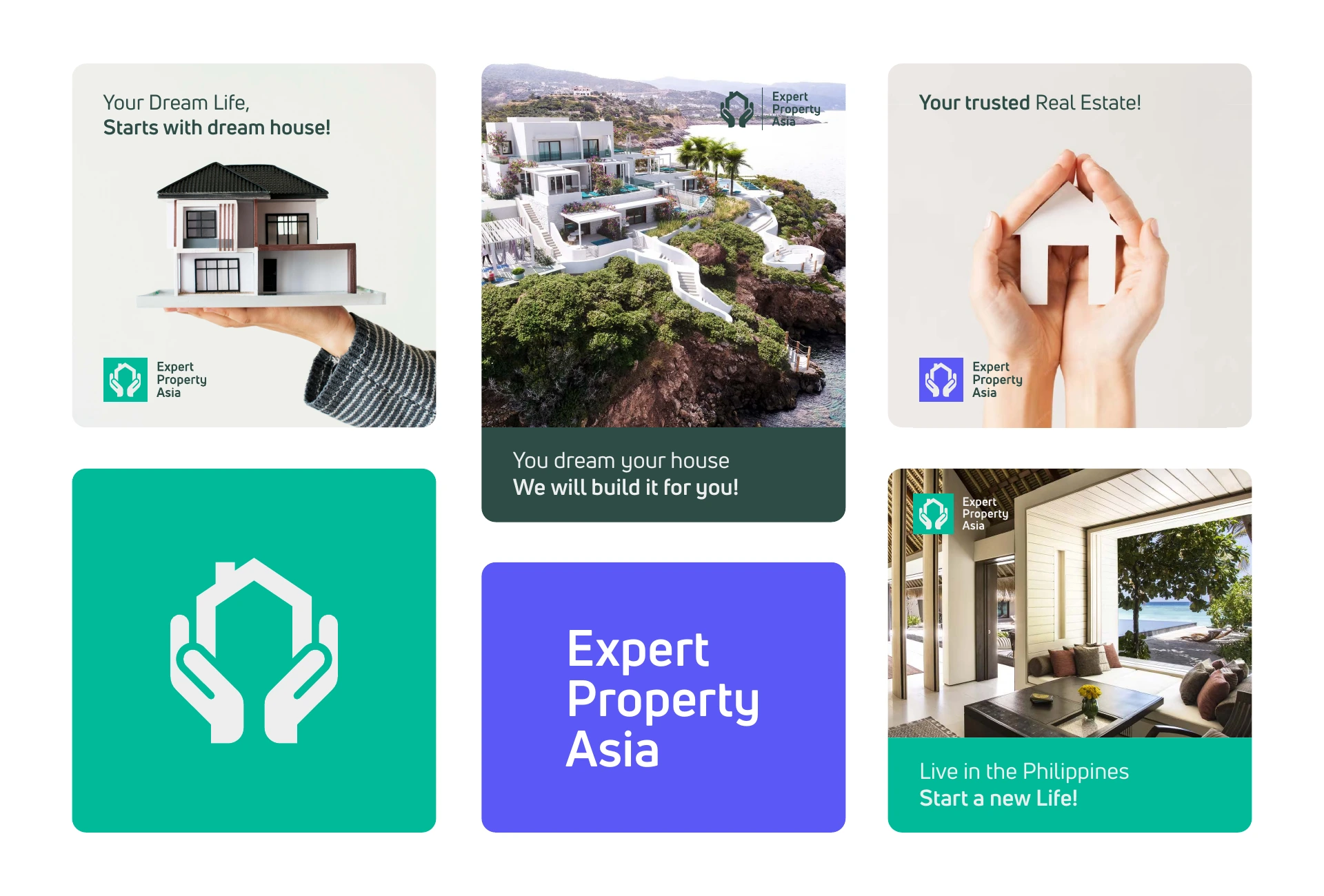
Hands and homes make the identity feel personal, not purely transactional.
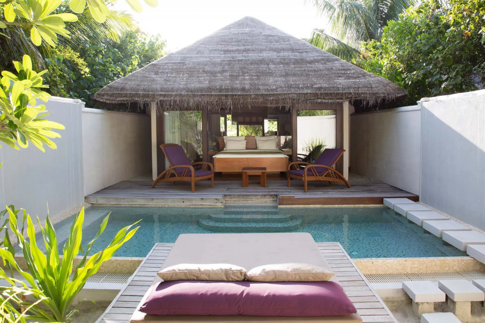
EPA / Expert Property Asia
 A human approach to property
Finding a home is personal. This identity for Expert Property Asia puts that idea at its center, pairing a reassuring symbol with an open, optimistic visual language.

The roofline makes the category instantly recognizable. The surrounding hands bring care into the same gesture. Together, they give the brand a clear and approachable signature.


Teal brings energy to the identity. Deep green gives it a grounded counterpart, while a confident violet adds contrast across the social concepts.
Screen colors sampled from the supplied brand presentation.
Property photography meets simple, human messages. The symbol, color blocks, and clear typography connect each composition to the same family.
The website concept carries the brand into a property-focused interface. A teal navigation bar, spacious typography, and an expansive coastal image create a welcoming first impression.
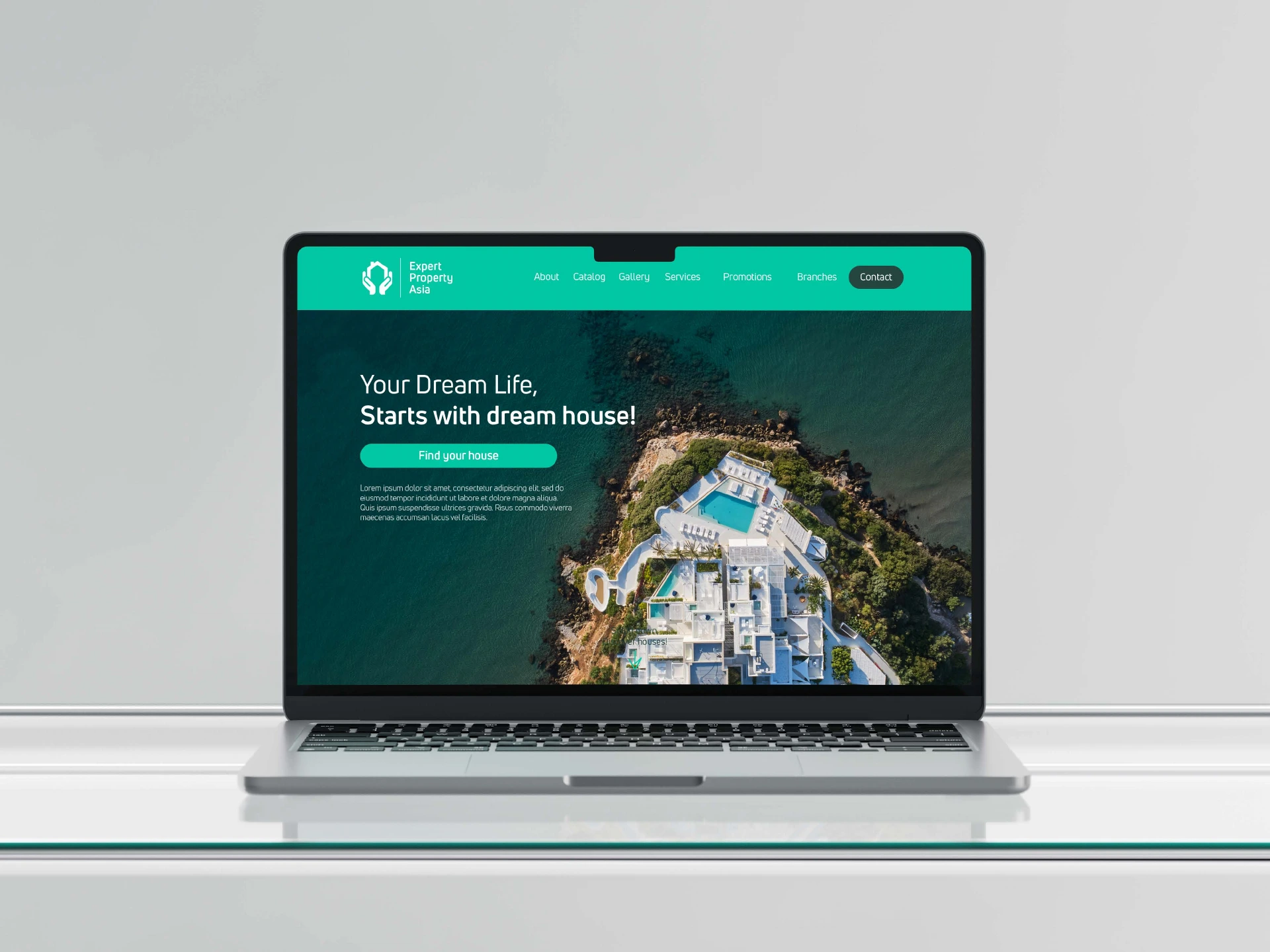
Website visual concept from the original identity presentation.