REVO Podcast Studio
Brand identity & digital design
A brand builtto be heard.
From sound to a visual system.
REVO / Brand guide showcaseScroll to discover ↓
REVO / Brand guide showcaseScroll to discover ↓
REVO Podcast Studio
Brand identity & digital design
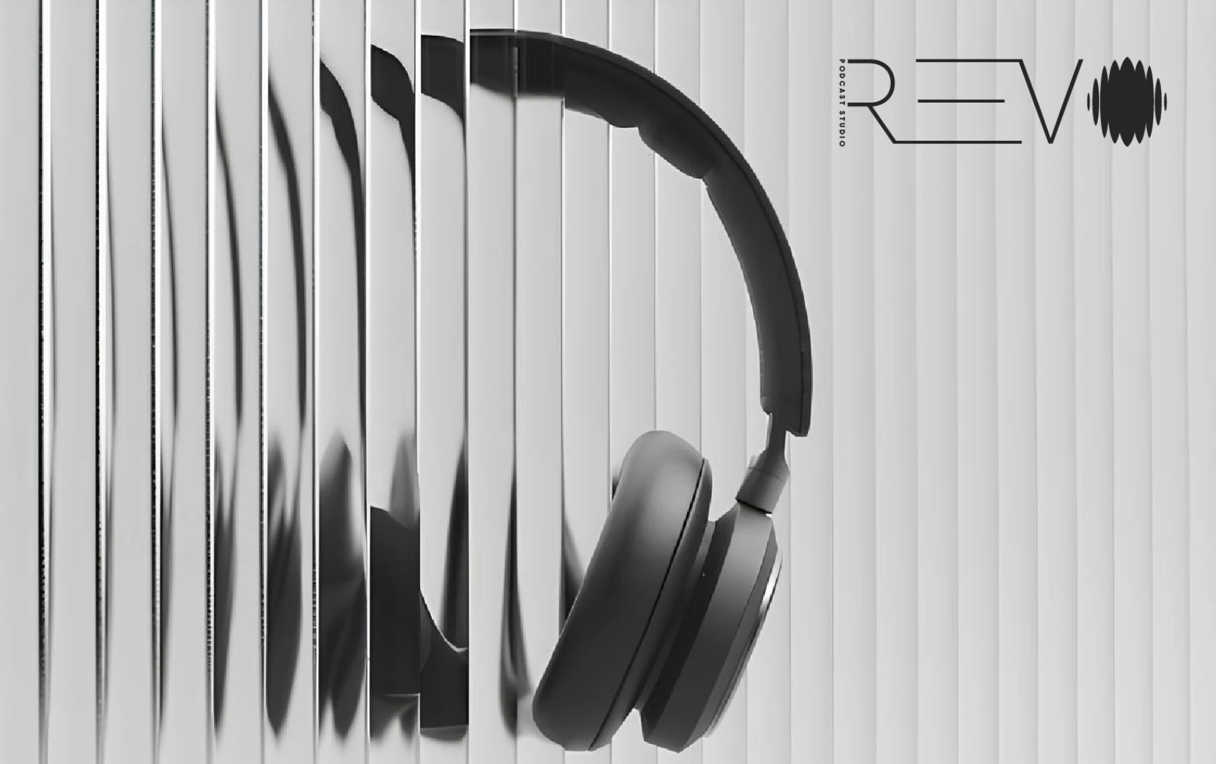
A visual identity for a studio built around voices. REVO brings the language of sound into view: a waveform becomes a symbol, fine lines become movement, and a restrained grayscale palette lets every detail speak.

Precision in the letterforms.
Energy in the waveform.
One unmistakable signature.
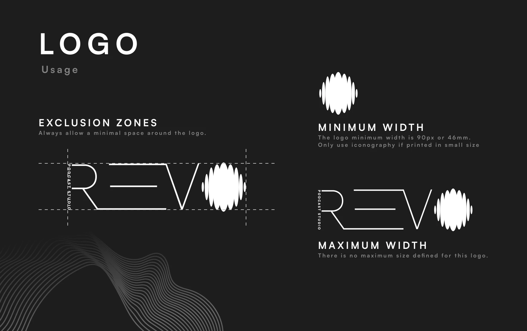
REVO / Primary wordmark
Loud presence.
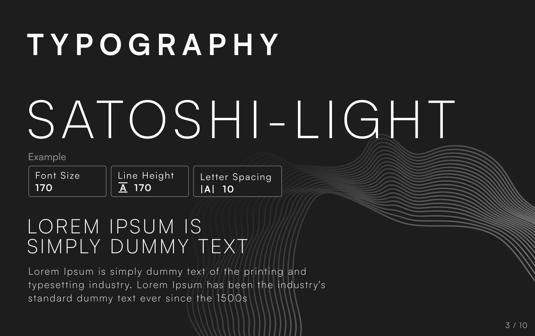
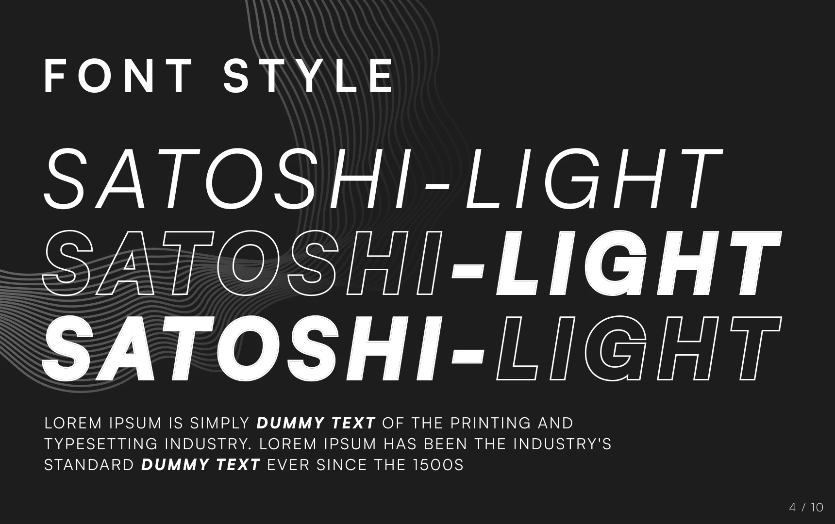
The brand guide pairs the clarity of Satoshi Light with expressive italic, outlined, and bold treatments. Space gives the quieter details room to breathe.
Charcoal, mid-gray, and silver form the core palette. Supporting grays create depth, contrast, and a consistent backdrop for the studio’s visual language.
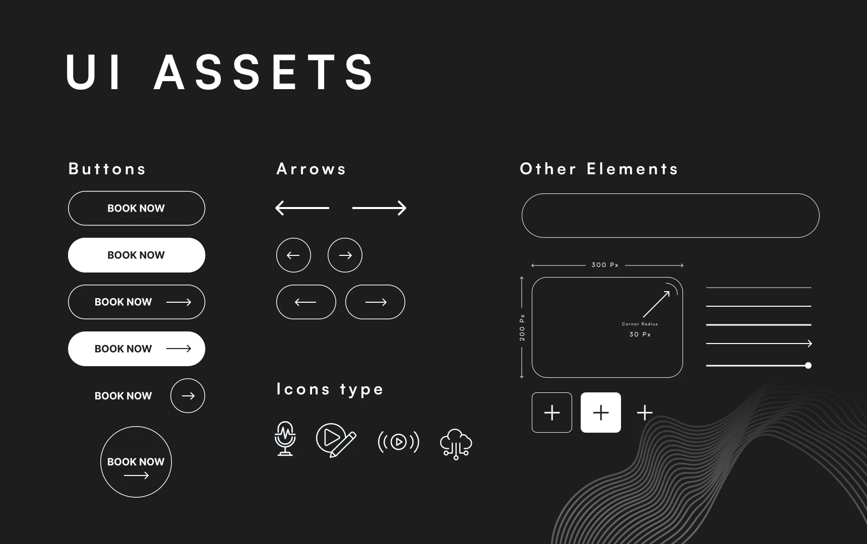
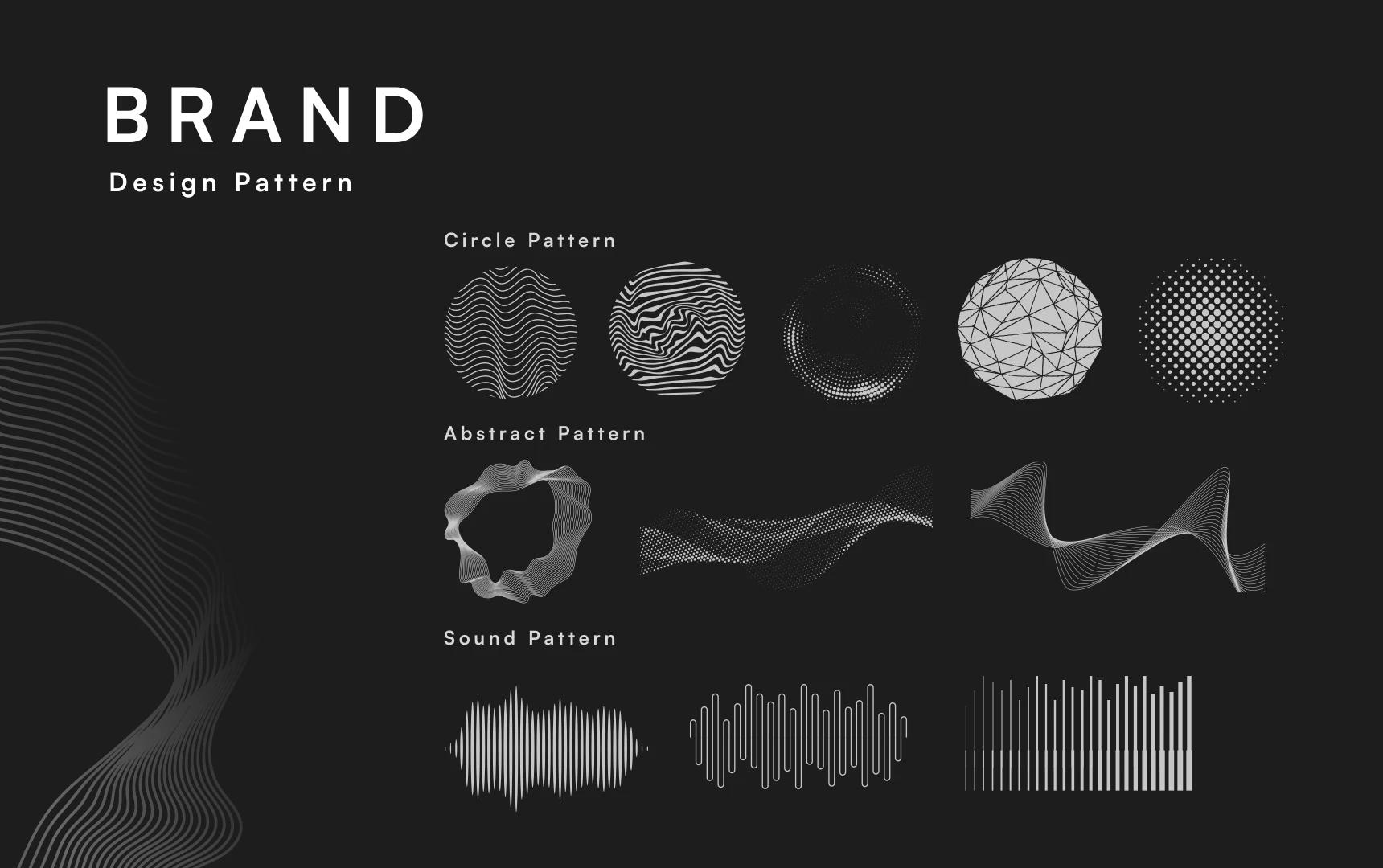
Circular forms, flowing contours, and sound patterns build a flexible family of graphics. The same rhythm carries from the wordmark to a poster, a social frame, or a digital interface.
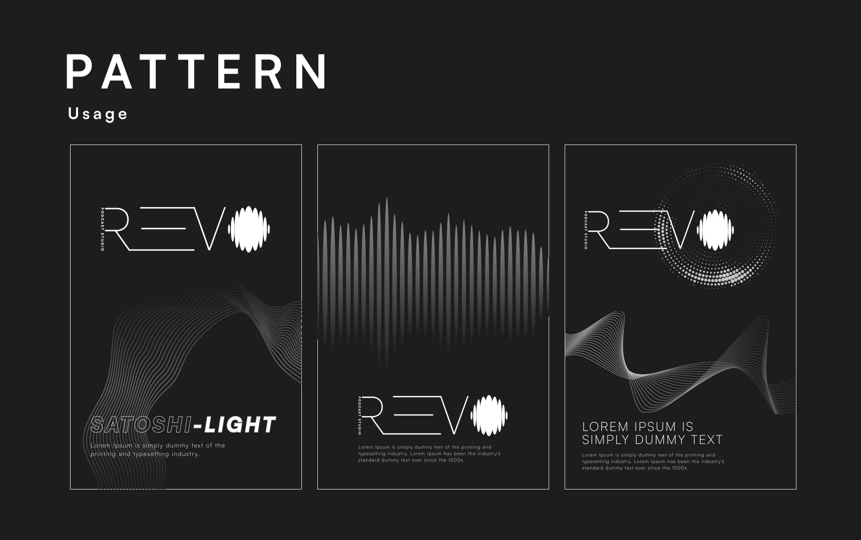
Bold, compressed headlines bring a new level of volume to the brand. Repeating lines and the REVO signature keep every piece connected to the same visual system.
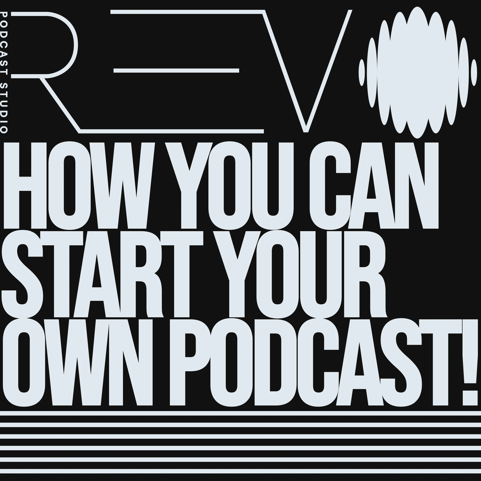

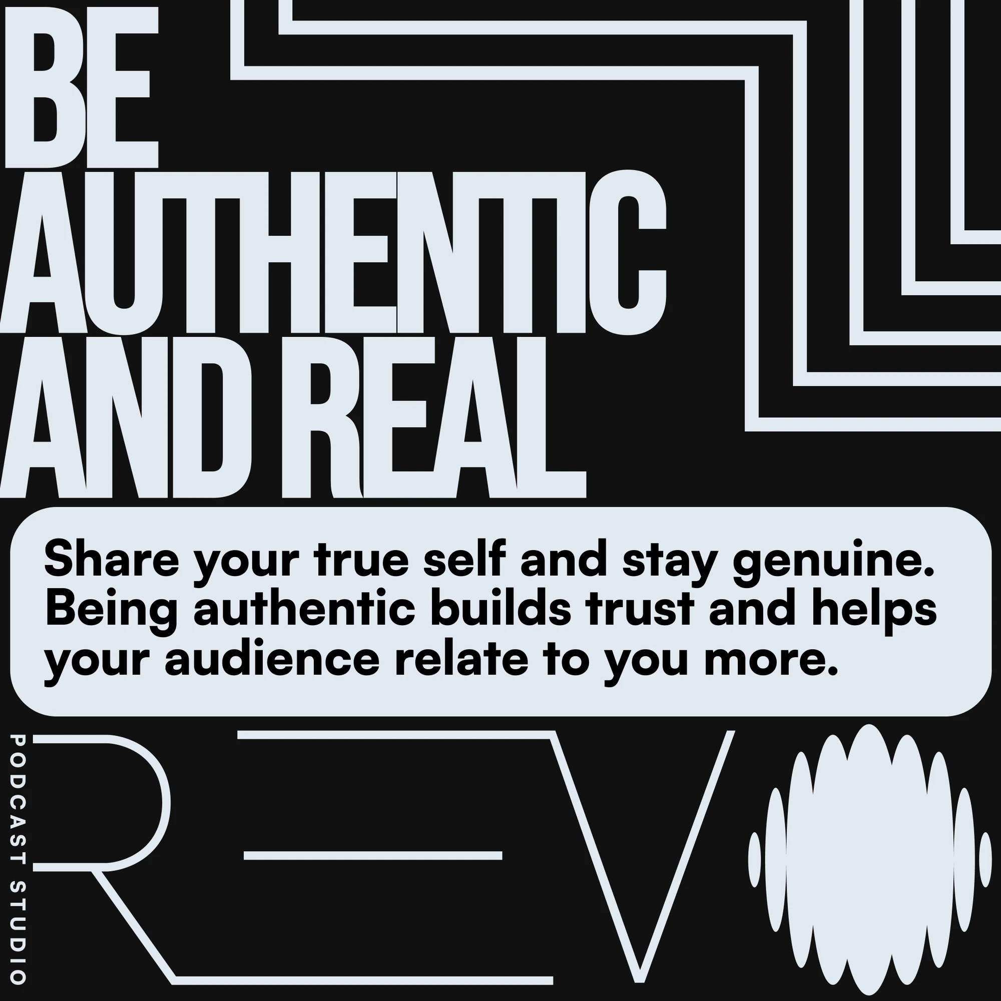
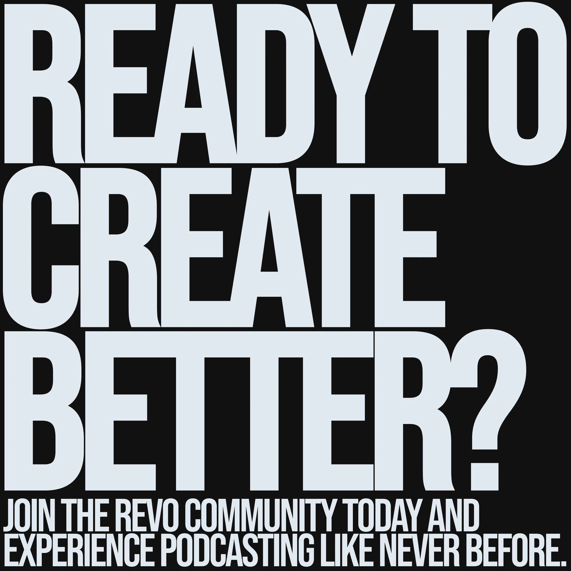
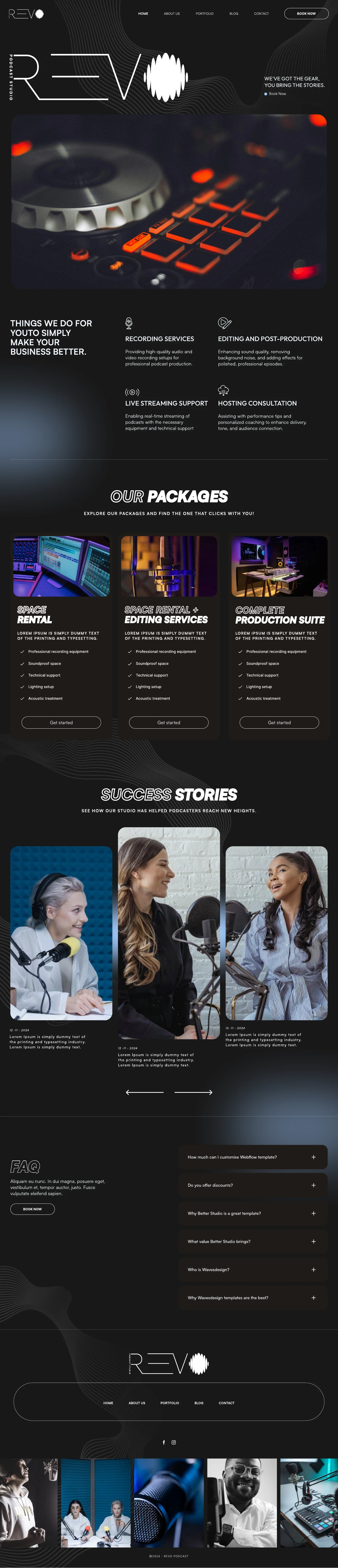
The website concept translates the identity into a complete studio experience, from recording services to packages and stories. Fine outlines, grayscale surfaces, and flowing patterns connect the interface to the brand guide.