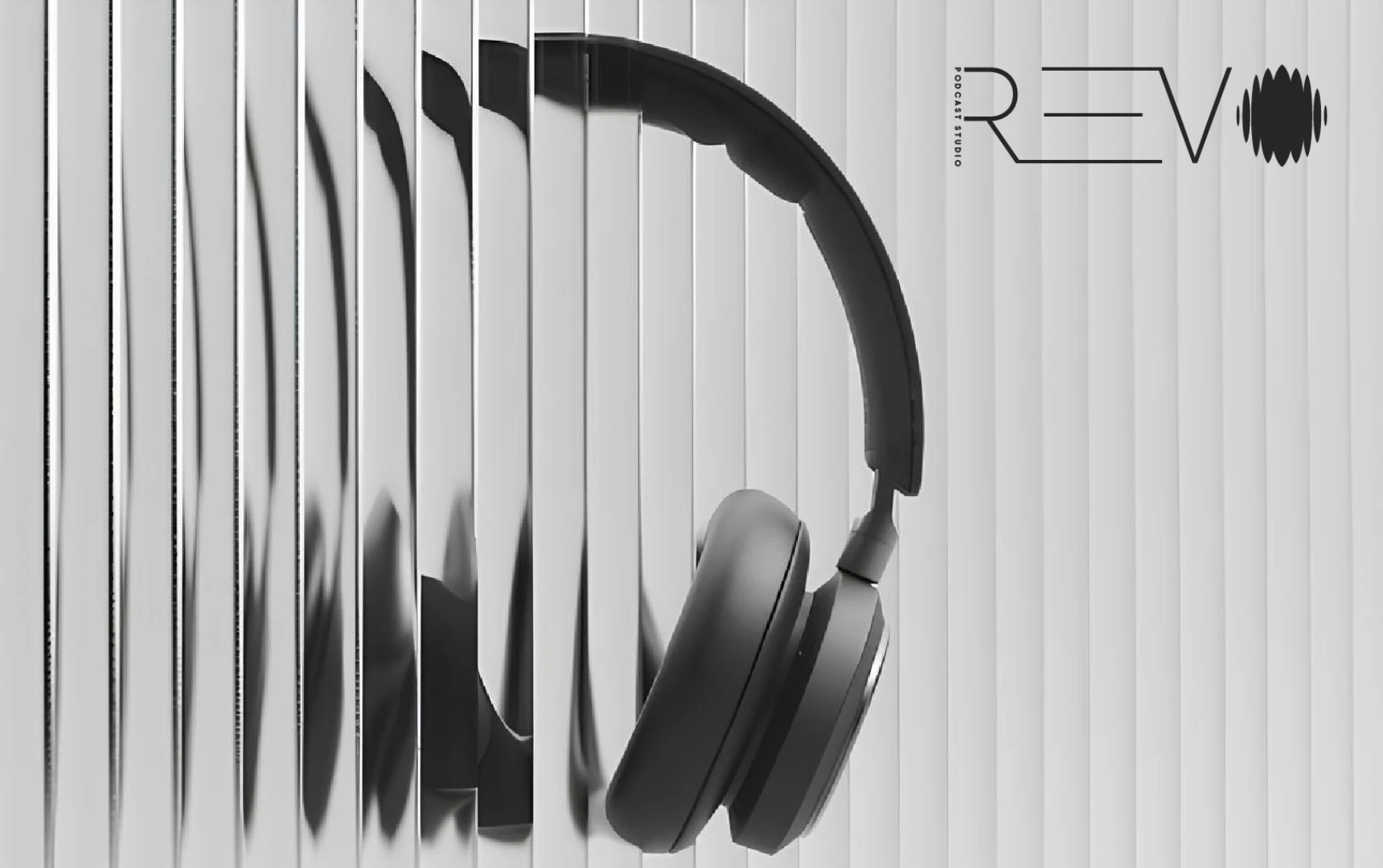
REVO headphones seen through sculptural vertical glass, in black and silver

REVO Podcast Studio
Brand identity & digital design

A brand builtto be heard.

From sound to a visual system.
REVO / Brand guide showcase
Scroll to discover ↓
01 / The ideaIdentity with a pulse

Give sound
a signature.

A visual identity for a studio built around voices. REVO brings the language of sound into view: a waveform becomes a symbol, fine lines become movement, and a restrained grayscale palette lets every detail speak.

Client
REVO Podcast Studio
Year
2024
Scope
Brand identity · Art direction
Applications
Digital design · Social content
02 / The signatureLine. Rhythm. Resonance.
REVO wordmark, with fine geometric lettering and a waveform symbol

Precision in the letterforms.
Energy in the waveform.
One unmistakable signature.

REVO / Primary wordmark

03 / TypographySatoshi / Light

Quiet form.

Loud presence.

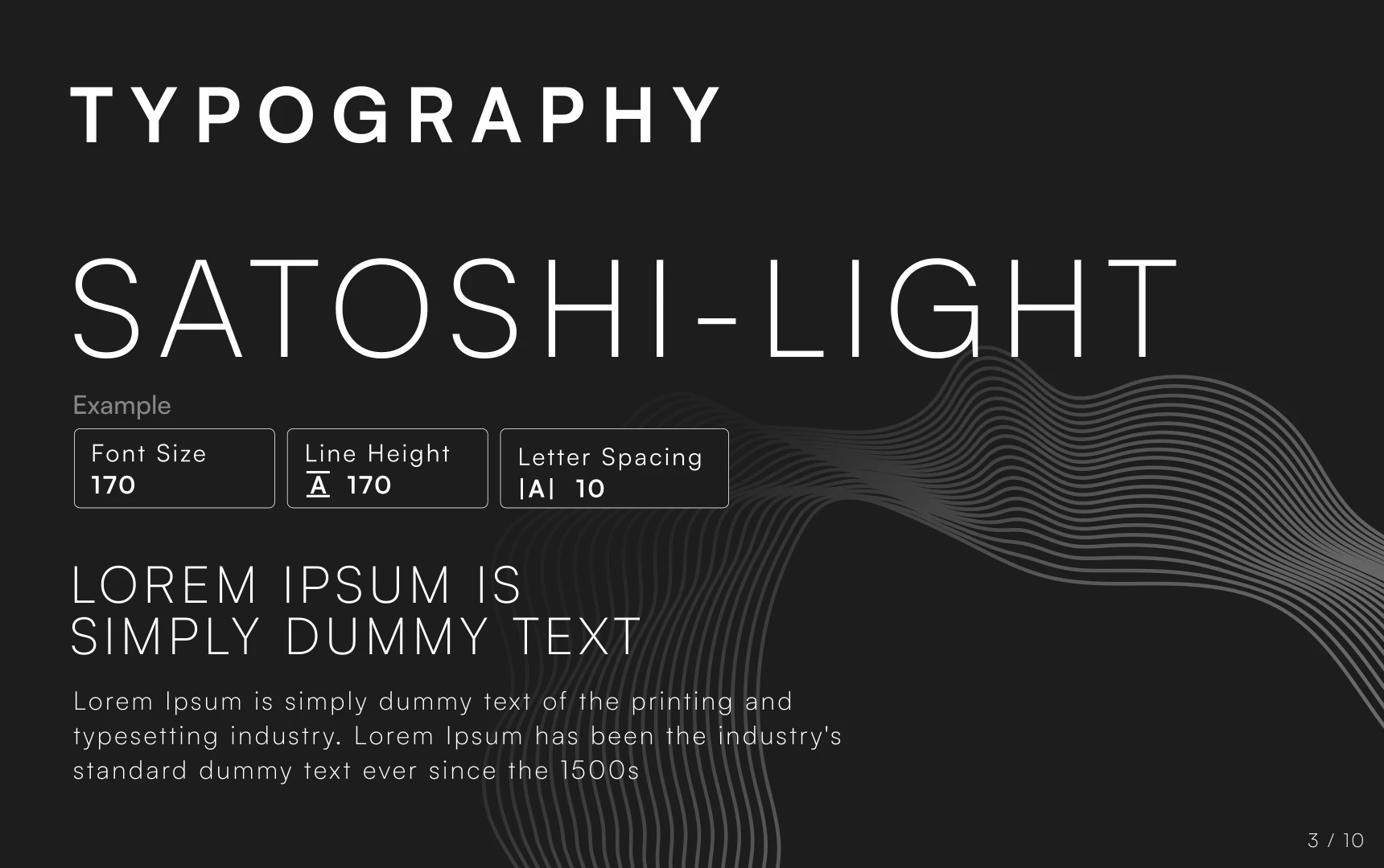
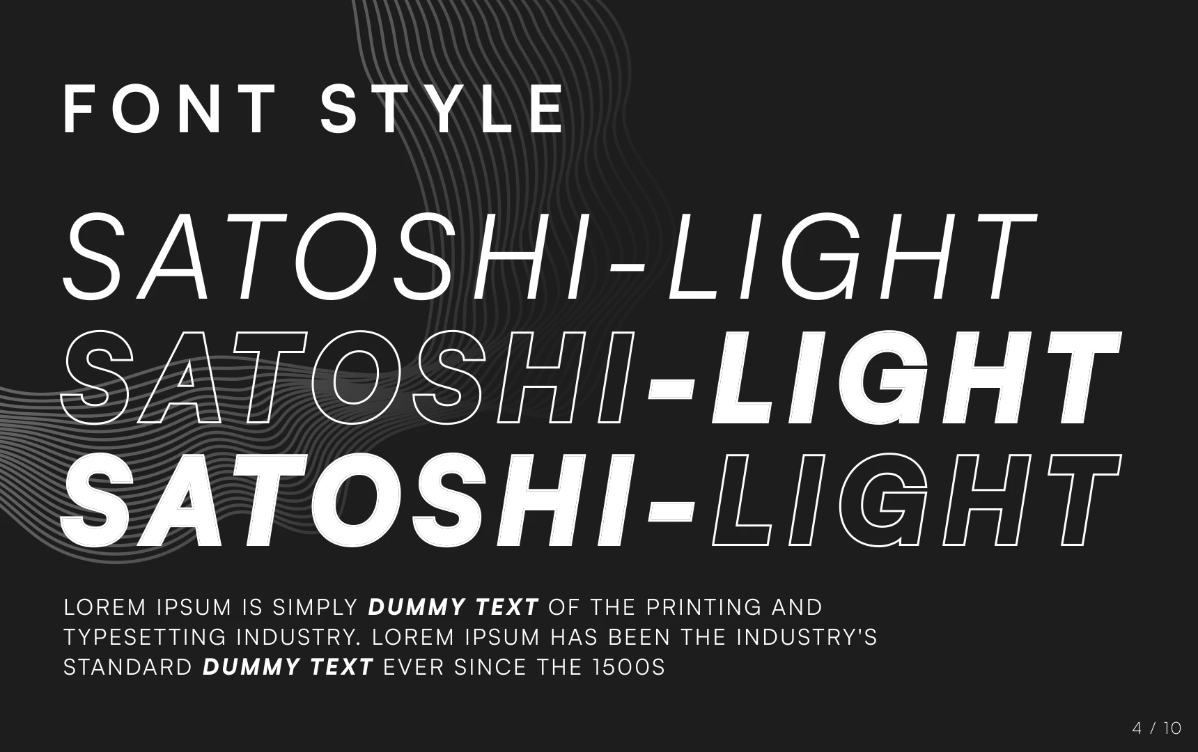
The brand guide pairs the clarity of Satoshi Light with expressive italic, outlined, and bold treatments. Space gives the quieter details room to breathe.
Aa Bb Cc Dd Ee Ff Gg
0123456789 & ? !
Original REVO typography guide specifying Satoshi Light
Typeface & spacing03 / 10
REVO font styles with light, italic, outline, and bold typography
Contrast & expression04 / 10
04 / The paletteA full spectrum of less

No distraction.
All character.

Charcoal, mid-gray, and silver form the core palette. Supporting grays create depth, contrast, and a consistent backdrop for the studio’s visual language.

01 / Charcoal#1D1D1DPrimary / RGB 29, 29, 29
02 / Mid-gray#747474Primary / RGB 116, 116, 116
03 / Silver#C6C6C6Primary / RGB 198, 198, 198
05 / The visual languageSound, made visible

A system
in resonance.

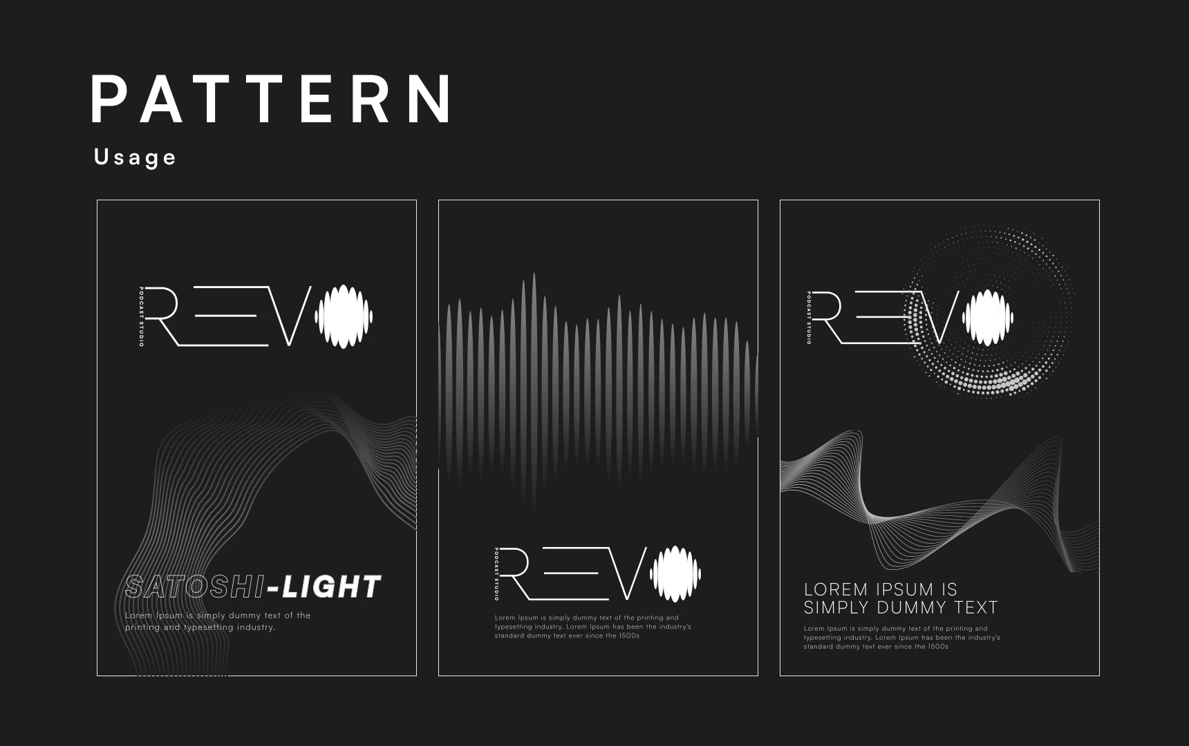
Circular forms, flowing contours, and sound patterns build a flexible family of graphics. The same rhythm carries from the wordmark to a poster, a social frame, or a digital interface.
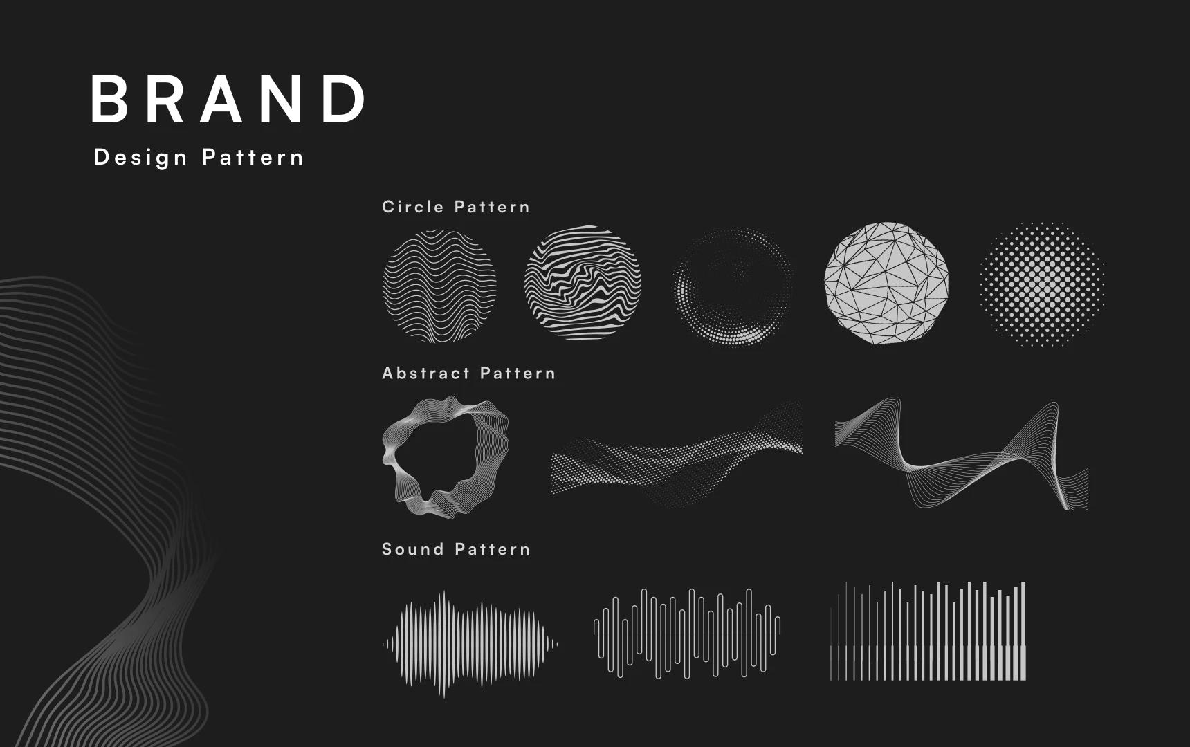
REVO brand pattern library: circular graphics, abstract flowing shapes, and soundwave patterns
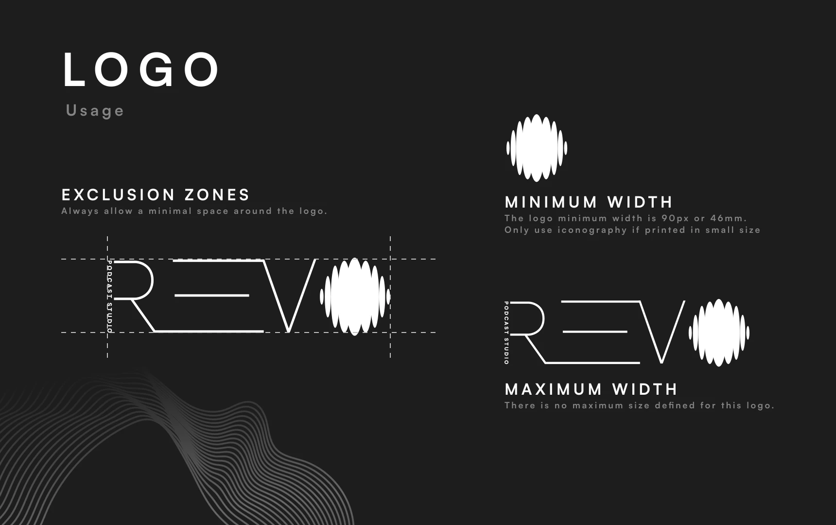
REVO logo usage guide, including exclusion zones and size rules
Space around the signatureLogo usage
Three compositions showing REVO brand patterns in use
One language, many expressionsPattern usage
06 / Social expressionThe identity out in the world

Built to
cut through.

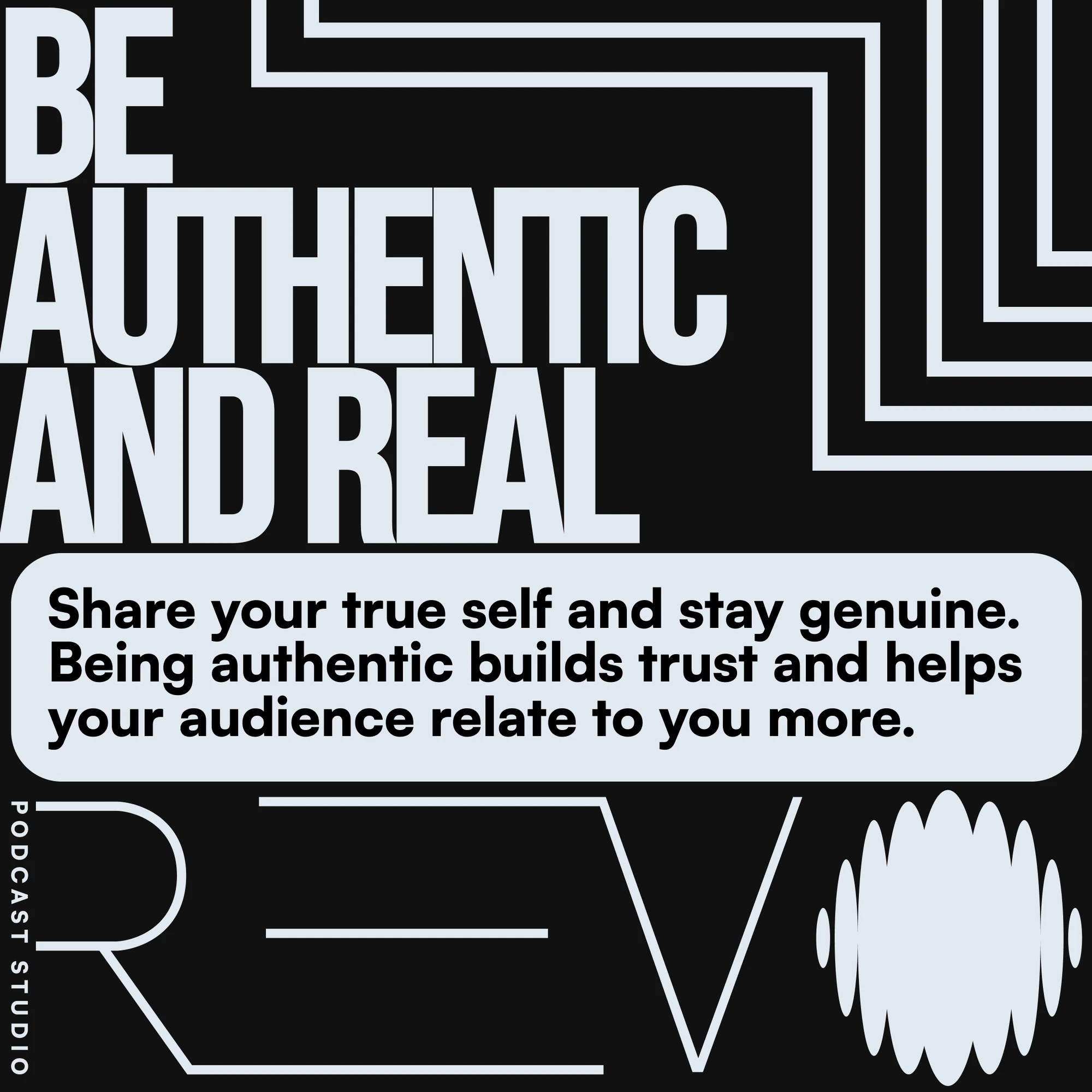
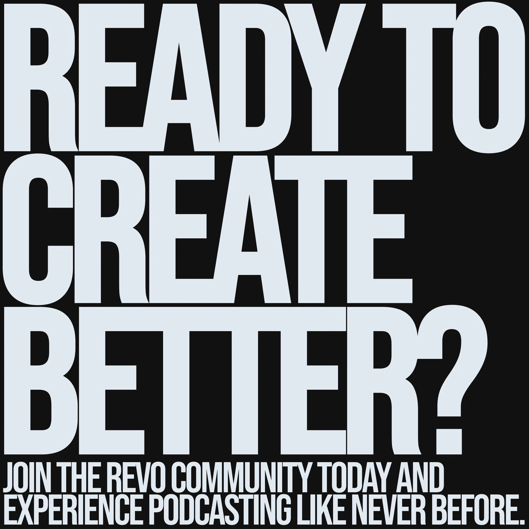
Bold, compressed headlines bring a new level of volume to the brand. Repeating lines and the REVO signature keep every piece connected to the same visual system.
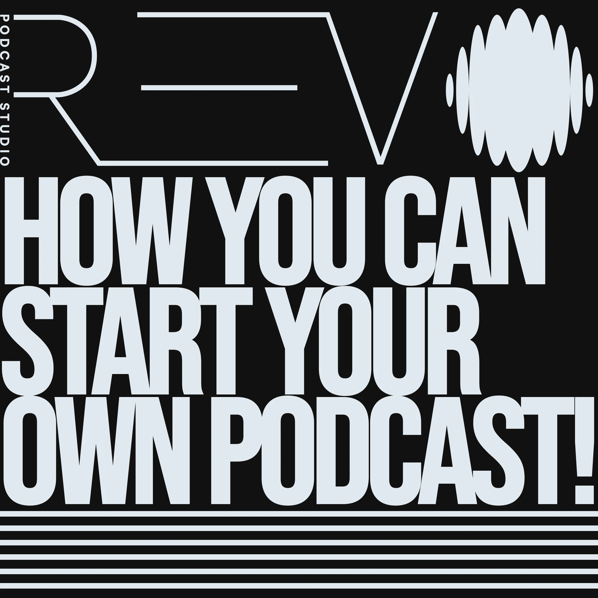
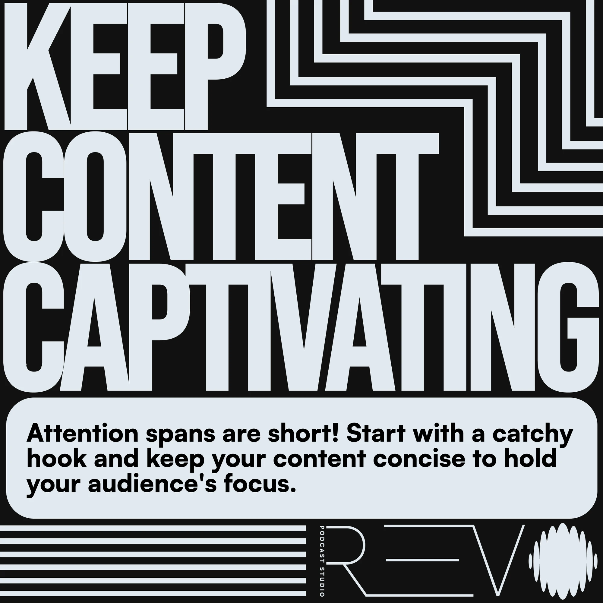
REVO social design: How you can start your own podcast
01 / Start a conversation
REVO social design: Keep content captivating
02 / Hold attention
REVO social design: Be authentic and real
03 / Find your voice
REVO social design: Ready to create better
04 / Keep creating
07 / Digital directionFrom identity to interface

The same voice.
A new surface.

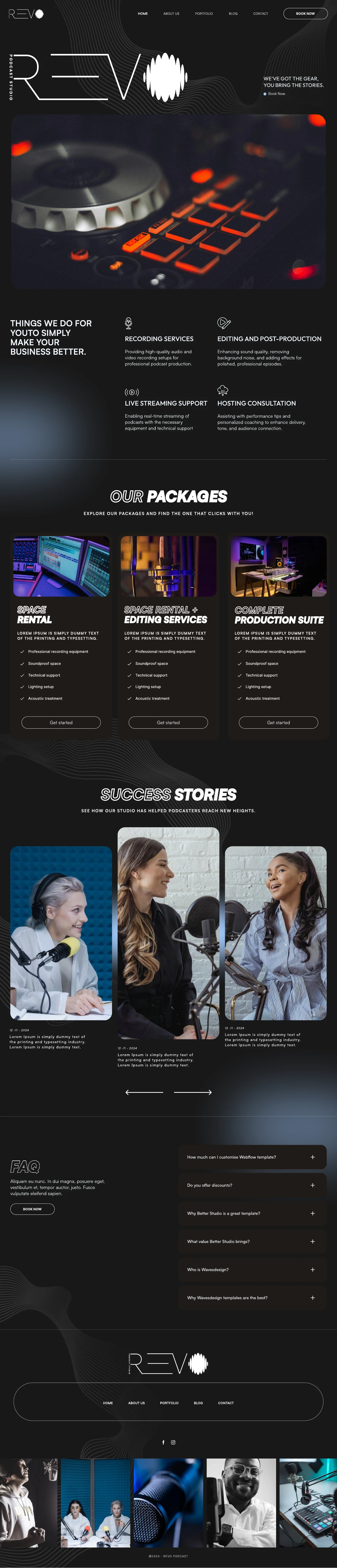
The website concept translates the identity into a complete studio experience, from recording services to packages and stories. Fine outlines, grayscale surfaces, and flowing patterns connect the interface to the brand guide.
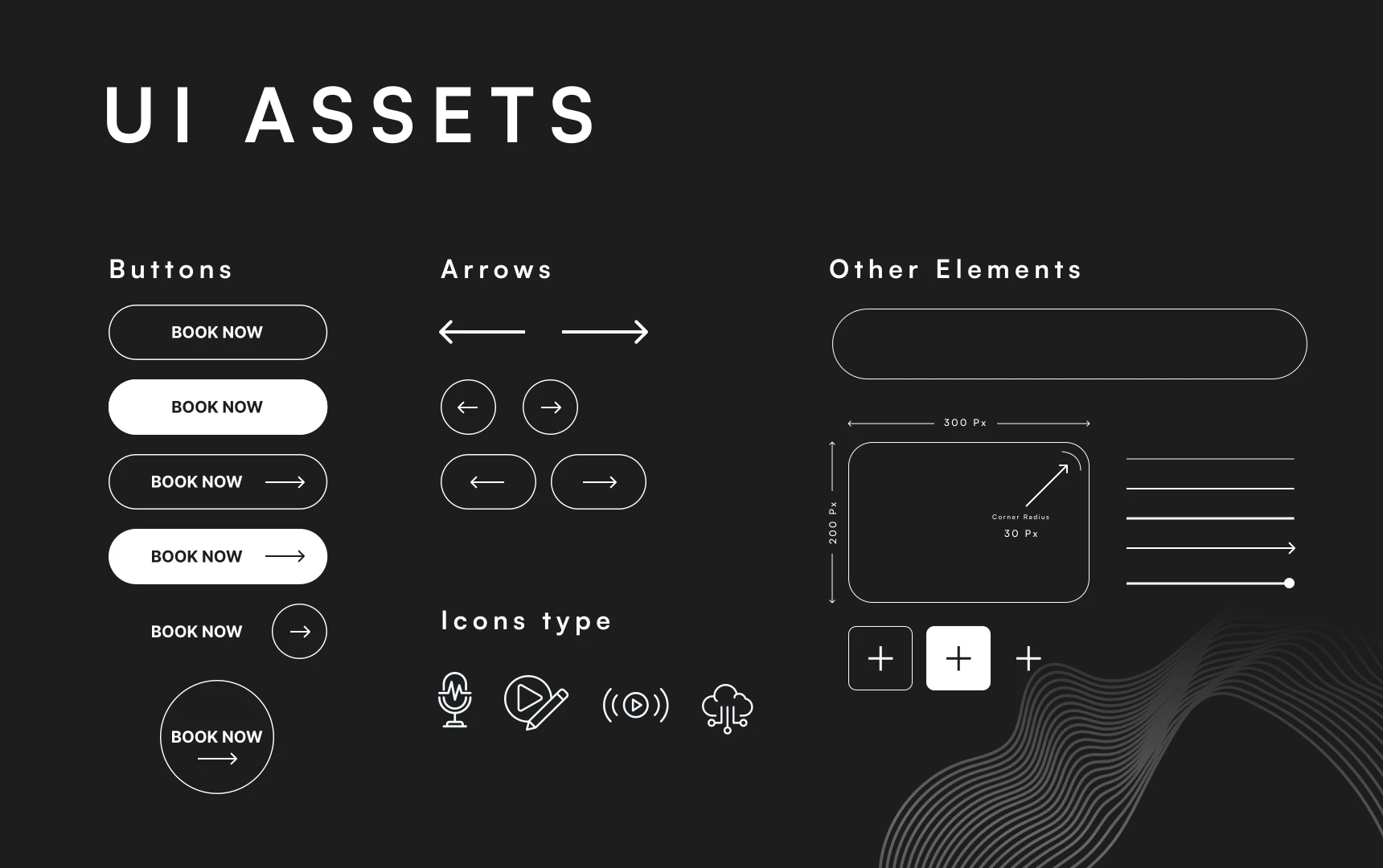
REVO UI assets: button styles, arrows, icons, and interface components
Interface toolkitButtons / arrows / icons
REVO / Website design concept
Full REVO website design concept showing the studio hero, recording services, packages, and stories


This website stores cookies on your computer. Cookie Policy